

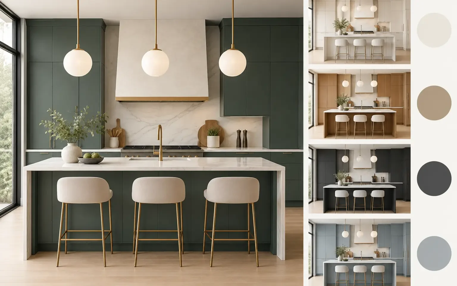
Cabinet Color Trends for Modern Luxury Kitchens
A cabinet finish is not a minor decorative decision. It sets the visual temperature of the room, affects how large the kitchen feels, and determines whether the design still feels considered after years of daily use. The most compelling cabinet color trends are moving away from stark, all-white uniformity and toward warmer, more architectural palettes that bring depth without sacrificing the clean lines of a modern kitchen.
For homeowners planning a high-end renovation or custom home in Houston, the goal is rarely to chase a short-lived look. It is to select cabinetry that reflects personal taste, works with the home’s light and materials, and is made to perform beautifully over time. That calls for a thoughtful approach to color, finish, and proportion.
Cabinet Color Trends Shaping High-End Kitchens
The strongest direction in contemporary European kitchen design is restraint with richness. Rather than relying on a single dramatic finish across every surface, designers are pairing complementary tones, mixing matte cabinetry with natural textures, and using color to create deliberate zones within the kitchen.
Warm undertones are leading the shift. Cool gray cabinetry, once a default choice for modern interiors, can feel austere unless balanced by generous daylight and warm materials. Soft taupe, mushroom, putty, stone, sand, and pale clay shades offer a more welcoming alternative. These colors remain neutral enough to support a long-term investment, yet they add dimension that pure white often lacks.
Natural wood is equally influential. Fine wood veneers and wood-effect finishes introduce visual warmth while preserving the streamlined appearance associated with German-made cabinetry. Oak in light, smoked, walnut, or caramel-toned variations is especially effective when used on an island, a tall storage wall, or a selected run of base cabinets. The result is modern, tactile, and far more layered than a kitchen built around one finish alone.
Warm neutrals replace cold minimalism
Warm neutral cabinetry has become a sophisticated foundation for contemporary homes because it works across architectural styles. A pale greige or soft beige can look crisp beside polished stone, but it also feels at home next to wide-plank flooring, aged brass, and textured plaster walls.
The distinction lies in the undertone. A neutral that appears beige in a showroom may read pink, green, or gray in a home with different natural light. Cabinet selections should be reviewed alongside countertop samples, flooring, backsplash material, and wall paint. In a kitchen with intense Texas sunlight, a warm ivory or sandy taupe may appear lighter and cleaner than expected, while a deep neutral can create a more intimate, tailored effect.
Warm neutrals are a particularly strong choice for perimeter cabinetry because they provide a calm backdrop for changing accessories and furnishings. They also allow the craftsmanship of a precise handleless detail, slim reveal, or integrated appliance panel to remain visible.
Wood cabinetry brings texture and permanence
The return of wood is not a return to heavy, traditional kitchens. Today’s wood cabinetry is usually expressed through clean slab fronts, controlled grain direction, and minimal hardware. It brings natural variation to otherwise tailored spaces, making a large kitchen feel more residential and less monolithic.
Light oak lends an airy, contemporary character and pairs well with creamy stone or porcelain surfaces. Smoked oak offers more contrast without the formality of very dark cabinetry. Walnut remains a classic luxury choice, particularly for a feature wall, beverage station, or island designed as a furniture-like centerpiece.
Wood does require balance. Using a strong grain across every cabinet can make the room feel visually busy, especially in an open-plan home. Combining wood tall cabinets with quiet matte base cabinets, or reserving the wood for the island, often produces a more polished composition.
Deep colors are becoming more refined
Deep green, blue-black, charcoal, and espresso tones continue to have a place in premium kitchen design, but their use is more selective than it was several years ago. Instead of coating an entire kitchen in a saturated color, many homeowners are using a darker finish to anchor one element of the room.
A forest green island against warm ivory perimeter cabinets can create a confident focal point. Deep blue cabinetry is elegant with pale oak and honed stone. Near-black finishes offer dramatic contrast, especially in homes with expansive windows and lighter surrounding materials.
The trade-off is light absorption. Dark cabinet colors can make a compact kitchen feel smaller if the lighting plan is not carefully developed. Layered illumination is essential: ambient ceiling lighting, task lighting at work surfaces, and integrated interior lighting in glass or display cabinets. A professional kitchen designer can also determine whether a dark finish should sit on lower cabinets, tall units, or the island rather than dominate every elevation.
Two-Tone Kitchens Remain a Strong Design Choice
Two-tone cabinetry is enduring because it solves both visual and functional needs. It gives the kitchen hierarchy. A darker or wood-finished island can establish the social center of the room, while lighter perimeter cabinetry keeps the overall space open.
The most successful pairings are typically subtle rather than high contrast. Mushroom and smoked oak, warm white and walnut, or sand and muted olive create distinction without feeling overly decorative. Strong black-and-white combinations can still work in a sharply contemporary setting, but they require disciplined detailing and often benefit from warmer flooring or metal accents.
Vertical placement matters. Light colors on upper or tall cabinets help a room feel open, while deeper shades below the counter line provide visual grounding. In kitchens with floor-to-ceiling cabinetry, a wood or darker niche can break up the elevation and create a place for open shelving, a coffee center, or a refined display area.
Choosing a Finish Beyond the Color Swatch
Color should never be specified in isolation. The finish itself changes the way a cabinet reads throughout the day. Matte lacquer surfaces diffuse light and create a soft, architectural appearance. They are well suited to warm neutrals, earthy greens, and deep charcoals. High-gloss finishes reflect more light and can make a compact space feel brighter, though they are best used intentionally in homes where a sleek, polished look is desired.
Texture adds another level of consideration. Fine wood veneers, textured laminates, and subtly structured matte surfaces can conceal minor marks better than highly reflective finishes. For active households, this practical point matters as much as visual appeal. A luxury kitchen should look composed after breakfast, dinner preparation, and a full weekend of entertaining, not only when photographed.
Hardware also changes the final impression. Handleless European cabinetry emphasizes uninterrupted planes and lets color and material lead. Integrated pulls offer a similarly tailored look with a more tactile point of contact. If decorative hardware is preferred, its finish should relate to the faucet, lighting, and adjacent living spaces rather than acting as an isolated accent.
How to Choose a Color Palette That Will Last
A lasting kitchen does not need to be plain. It needs a clear hierarchy. Start by identifying the room’s most permanent materials: flooring, countertops, architectural finishes, and large windows or doors. Cabinetry should create harmony with these elements rather than compete with them.
Then consider how you want the kitchen to feel. A light oak and warm-white palette feels open and relaxed. Taupe paired with darker stone feels quiet and tailored. Walnut with creamy cabinetry can feel distinctly luxurious and furniture-inspired. A deep green or blue island introduces personality while leaving the larger cabinet investment in a flexible neutral.
It is also worth considering sightlines. In an open-concept home, kitchen cabinetry is visible from the dining and living areas. Colors should support the broader interior scheme, particularly if the kitchen includes tall storage walls or a large island that reads like a major piece of furniture.
At Häcker European Collection, the design process is built around these decisions. Reviewing full-scale door samples, material pairings, room dimensions, and lighting conditions allows homeowners to move beyond a small swatch and select a finish with confidence.
The right cabinet color is the one that feels intentional in your home, supports how you live, and gives the architecture room to speak. Bring flooring, countertop, and inspiration samples to a design consultation, then evaluate the palette as a complete composition rather than a collection of individual finishes.

